Civica Case Study

Role:
Graphic Designer & UX Designer
Overview:
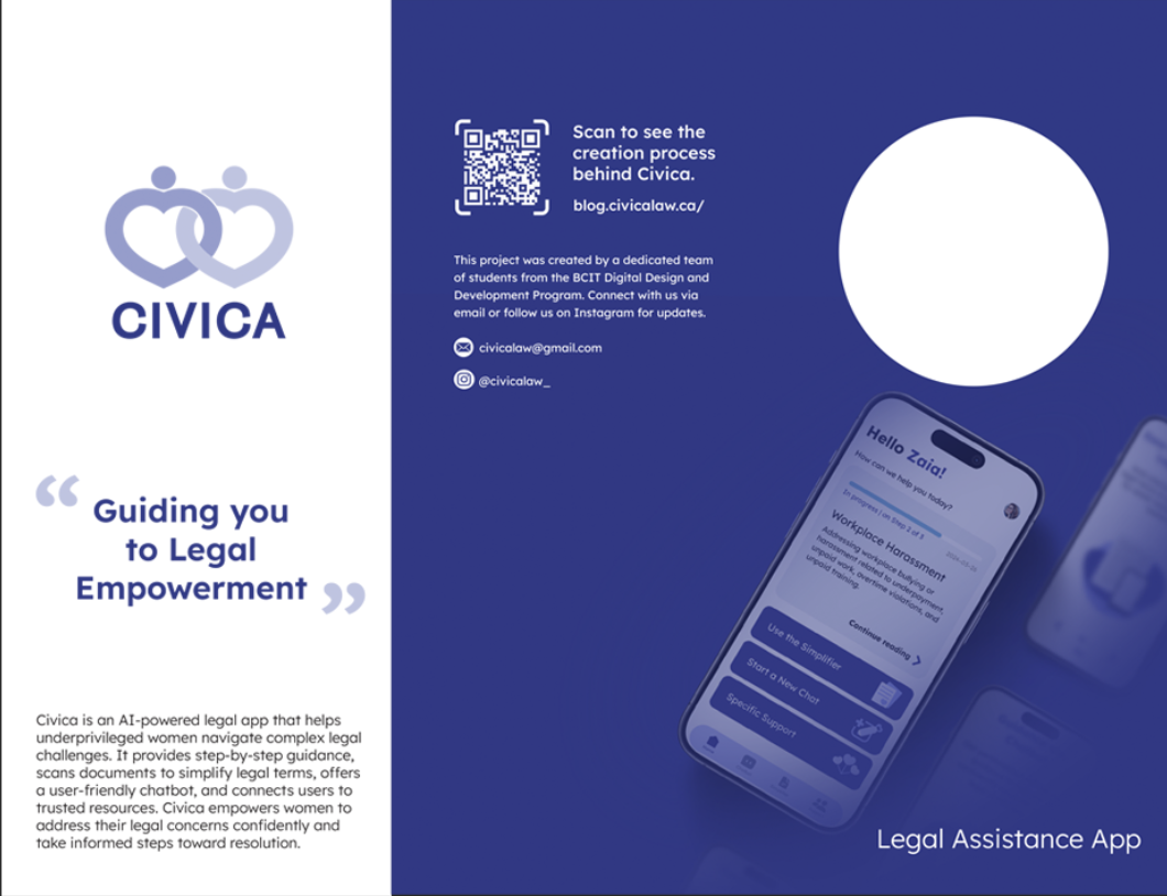
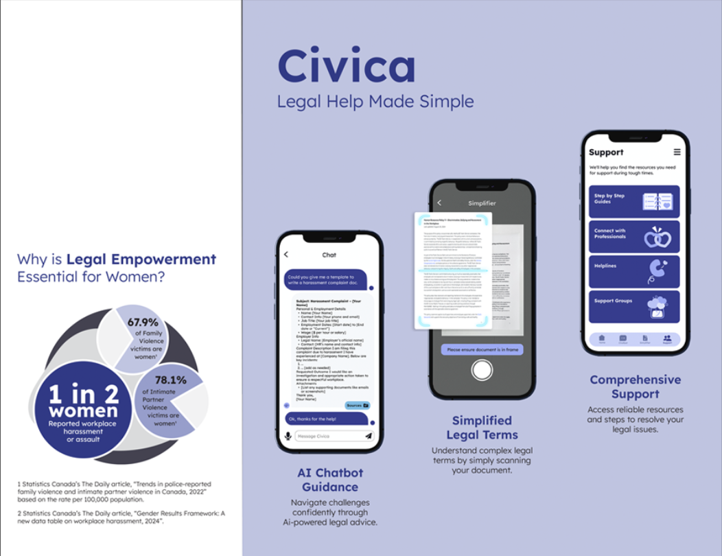
Civica is a legal advice app targeted towards vulnerable and under-privileged women who are having trouble navigating the legal system. Civica includes an AI chat-bot, document simplifier, and support links and services.
What is the problem Civica is trying to solve?
Upon researching, Civica found that:
- 1 in 2 women reported workplace harassment or sexual assault.
- 85% of vulnerable women cannot access civil legal aid.
- 77% reach a crisis point before receiving legal help.
As a female-led team, Civica resonated with these statistics and decided to create a potential solution for these common problems: women being unable to access civil aid and exercise their legal rights. With Civica, under-privileged women would have access to reliable and free legal advice.
The Solution
Civica built a platform that gives women the tools to navigate the legal system step by step. It simplifies the process, reducing mental and emotional strain while empowering women to take legal action.
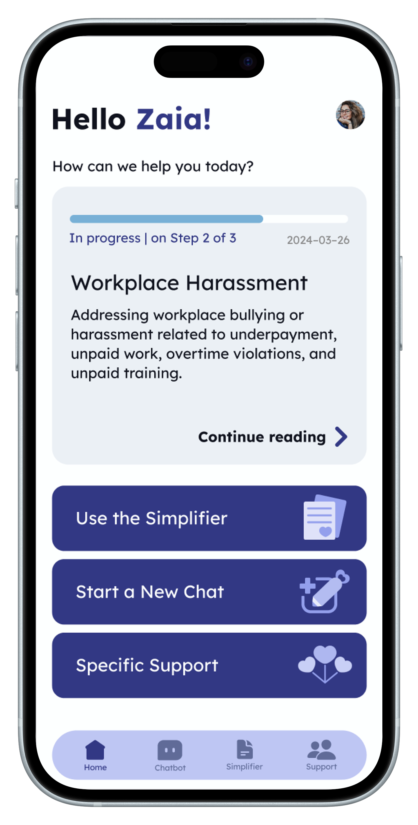
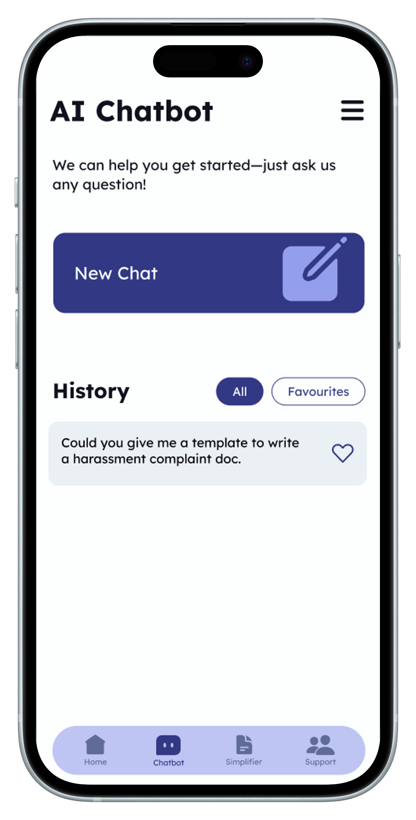
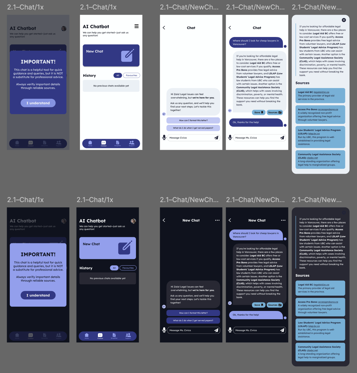
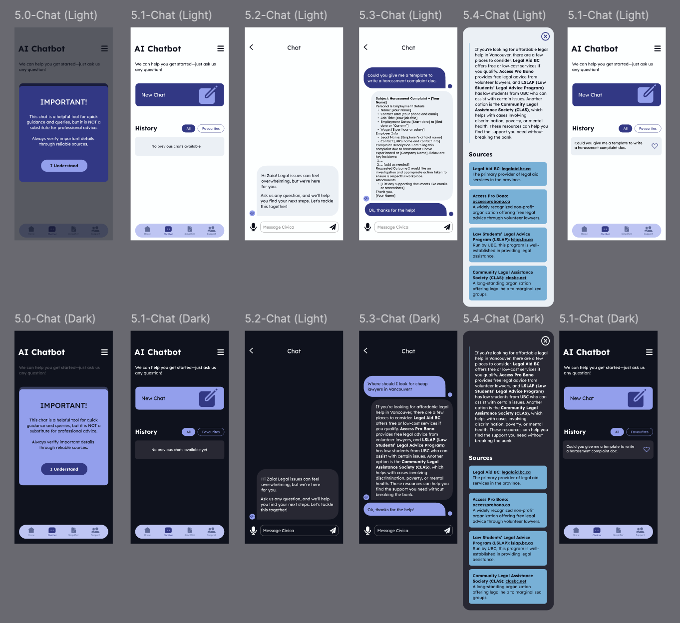
- AI Legal Advice Chatbot
- Document Simplifier
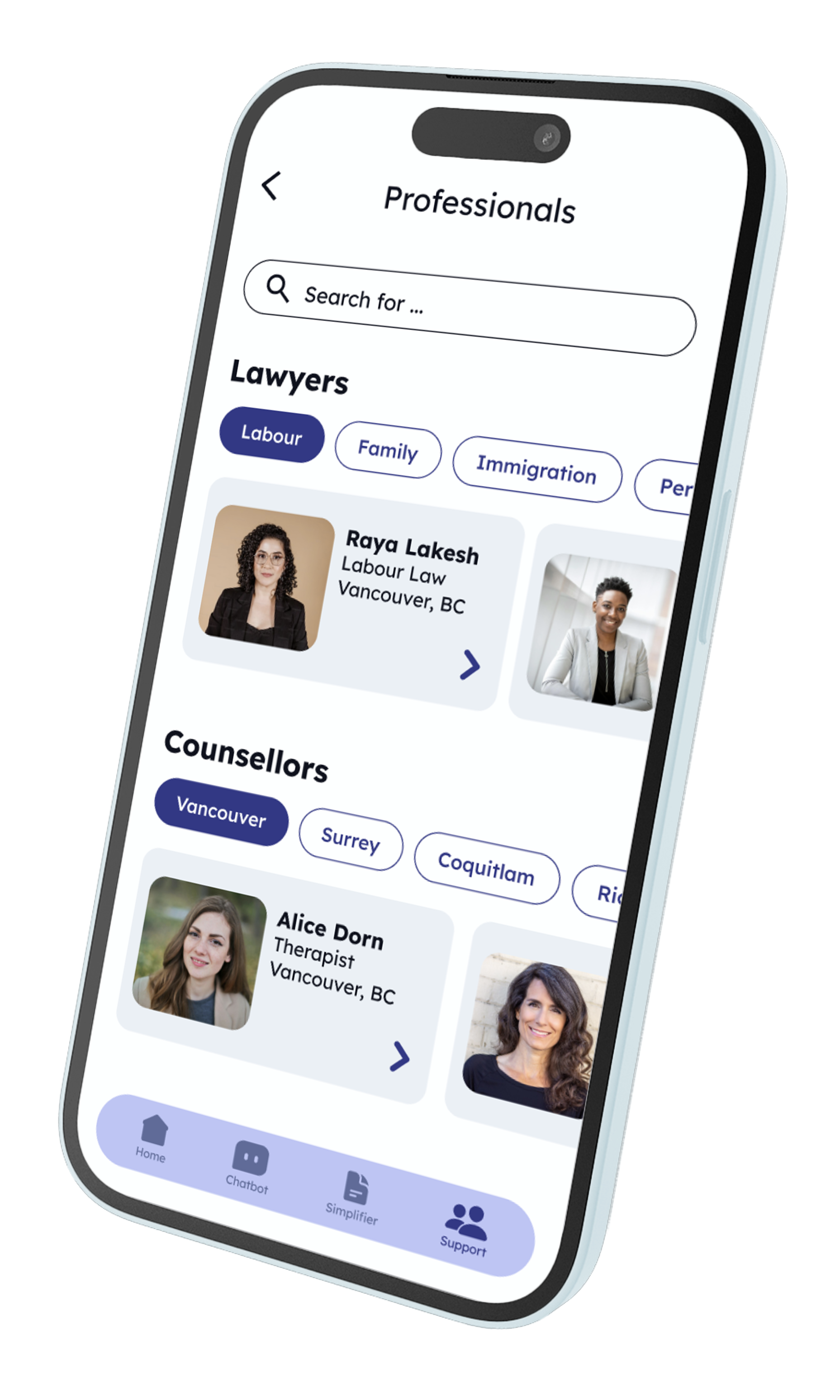
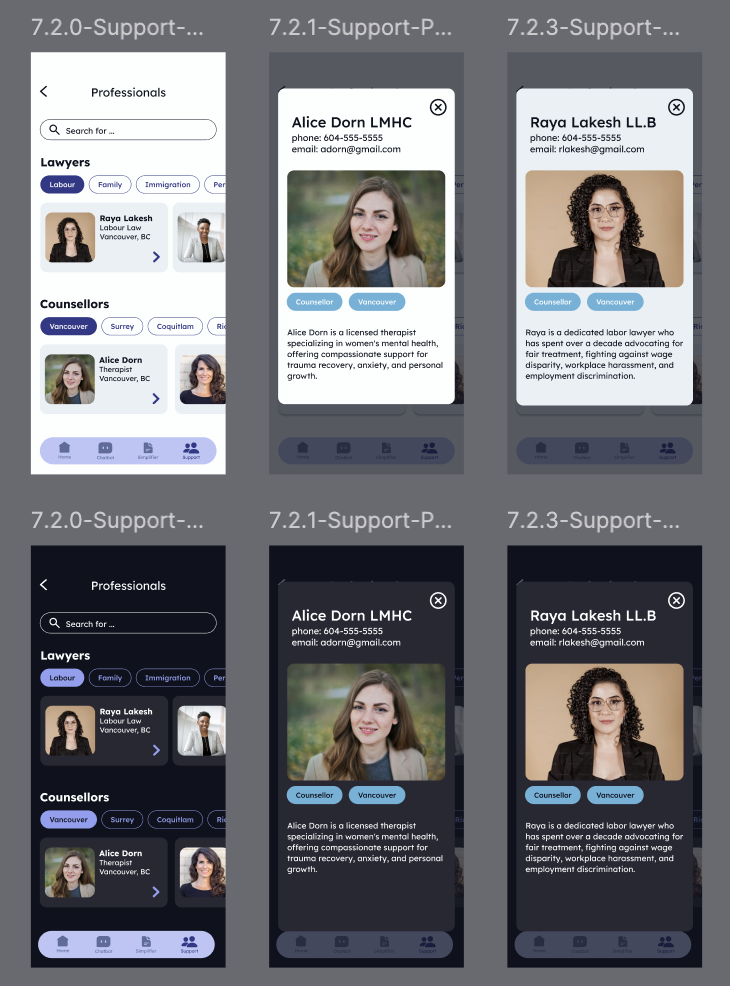
- Personalized Support Links
Design Process
Civica wanted to maintain a consistent, clean design throughout the app, complete with a limited colour palette, icons, and accessible options.
Logo
Starting with the logo, Civica went through several ideation processes. At first, we wanted to have the Civica “C” front and centre along with a heart. After feedback, it was clear that it just looked like an “E”, so a heart-focused design was adopted.

Color Palette
The intended impact of the colour palette was to invoke feelings of trust, comfort, and professionalism. The palette went through several iterations and after user feedback it was chosen and implemented.
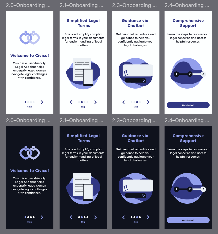
Lo-Fi Prototype & Final Design
Civica wanted the home page to be consistent with the rest of the app and look professional. The initial version had too much going on and was overwhelming, so the next version and the final version were a lot simpler, while still having the necessary elements.
First Iteration
After completing the initial version, further testing and research were conducted with users and professionals to confirm and refine the design. Two key areas for improvement were identified:
Visual Tone:
The mascot, intended to guide users through the app, ended up being more distracting than helpful due to its sporadic appearances. Its overly cute design also clashed with the serious and professional image the app aimed to project. Moreover, the pink and blue color scheme reminded some users of a gender reveal, making it feel too soft for an app dealing with legal matters.
Ease of Navigation:
The main feature, document scanning, was buried under multiple clicks, making it hard for users to access quickly. The grammar check function was found unnecessary and could instead be combined with the AI chatbot for better efficiency. Additionally, users had trouble finding the step-by-step guides since they weren’t placed in the expected support section.
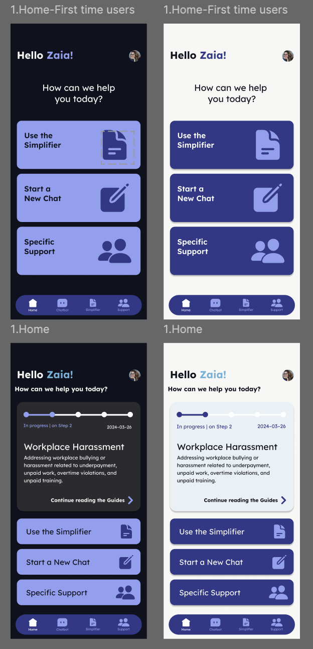
Final Version:
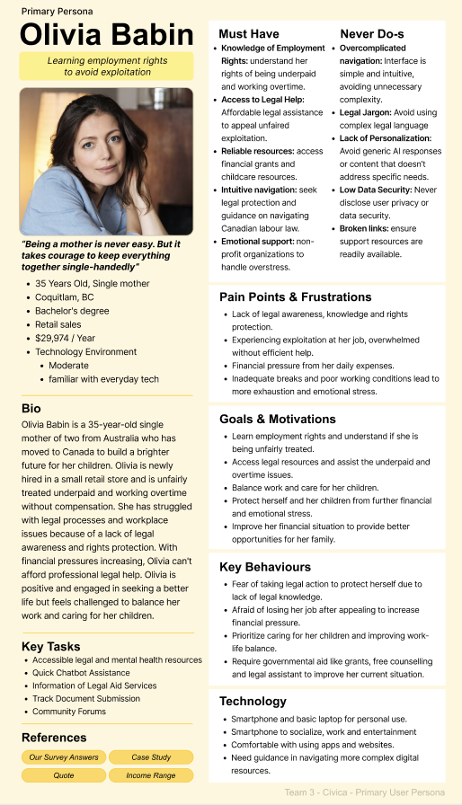
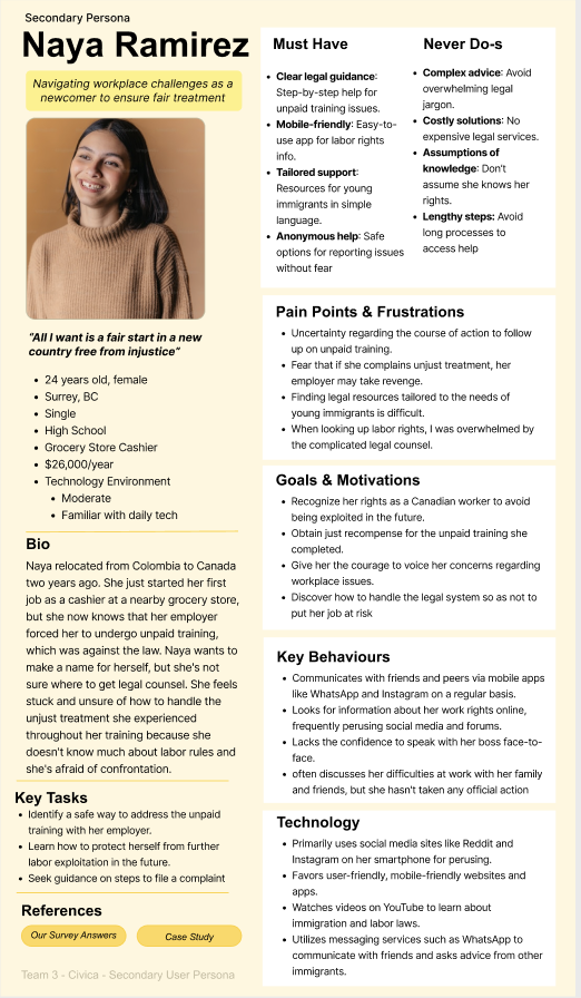
User Research
Extensive research was conducted early on to confirm the problem and understand user challenges. Insights from surveys, competitive analysis, interviews, and case studies guided the development of effective solutions. Civica’s design targets three main issues: the stress of navigating an unfamiliar legal process, confusion caused by complex legal language, and the difficulty of finding affordable, reliable legal assistance.
Interviews:
An immigration lawyer was interviewed to gain firsthand knowledge from real cases, ensuring Civica’s solutions address genuine challenges. This provided valuable insight into the hardships, requirements, and legal barriers women encounter, helping Civica improve its methods and offer better support to those in need. Here are some examples:
- Driver’s Test Incident and Insurance Misconduct
- PR Fraud through Marriage and Business Exploitation
- Landlord Harassment and Uncomfortable Living Conditions
- Exploitation of a Permanent Resident – Worker at a Public Laundry
- Unpaid Training Period for Employees at a Grocery Store
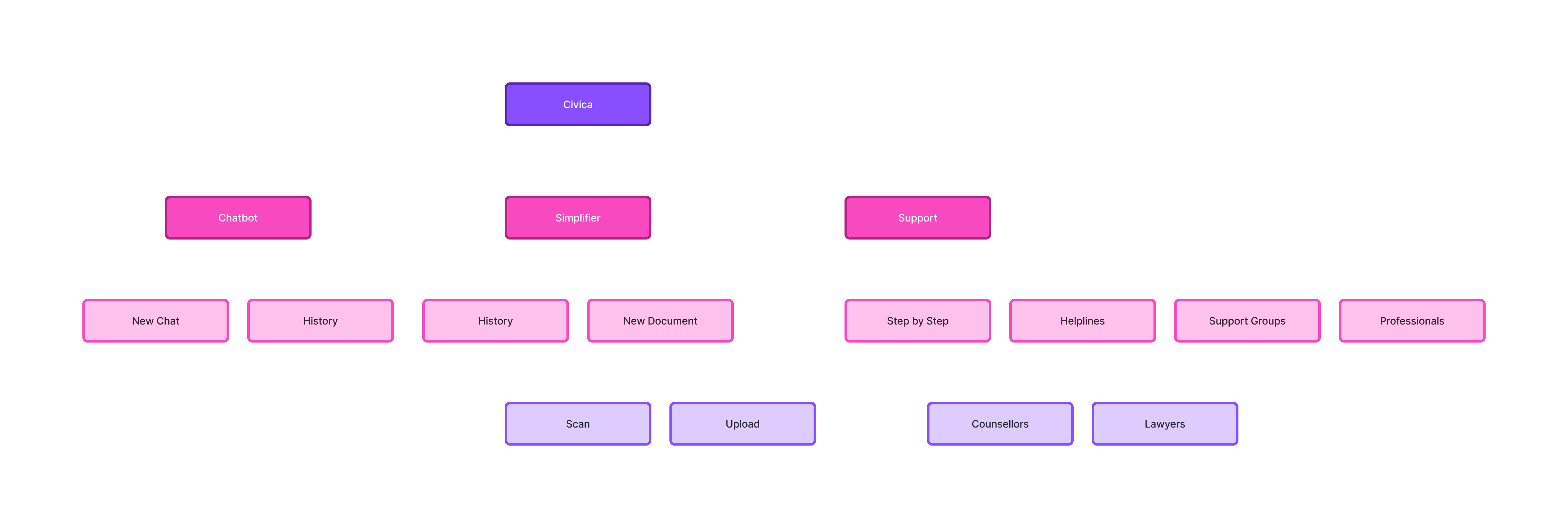
Final Site Map
Marketing Efforts
To help more people learn about Civica, several simple but effective strategies were put in place. A website with a blog was created to share weekly updates, introduce the team, and explain the platform’s features, while also making it easy to connect with others. Instagram posts were used to spread the word about the Student Design & Technology Showcase, where Civica was presented as an important project. These efforts focused on being open, building interest, and connecting with the community.
Printed Marketing Materials
Brochures
Business Cards