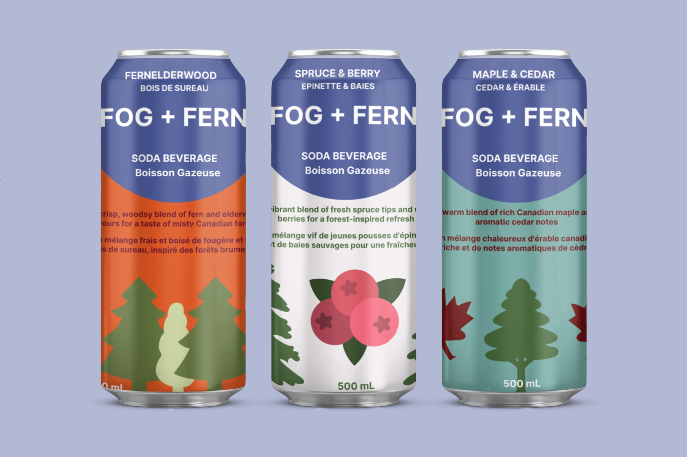
Can Sleeves Project
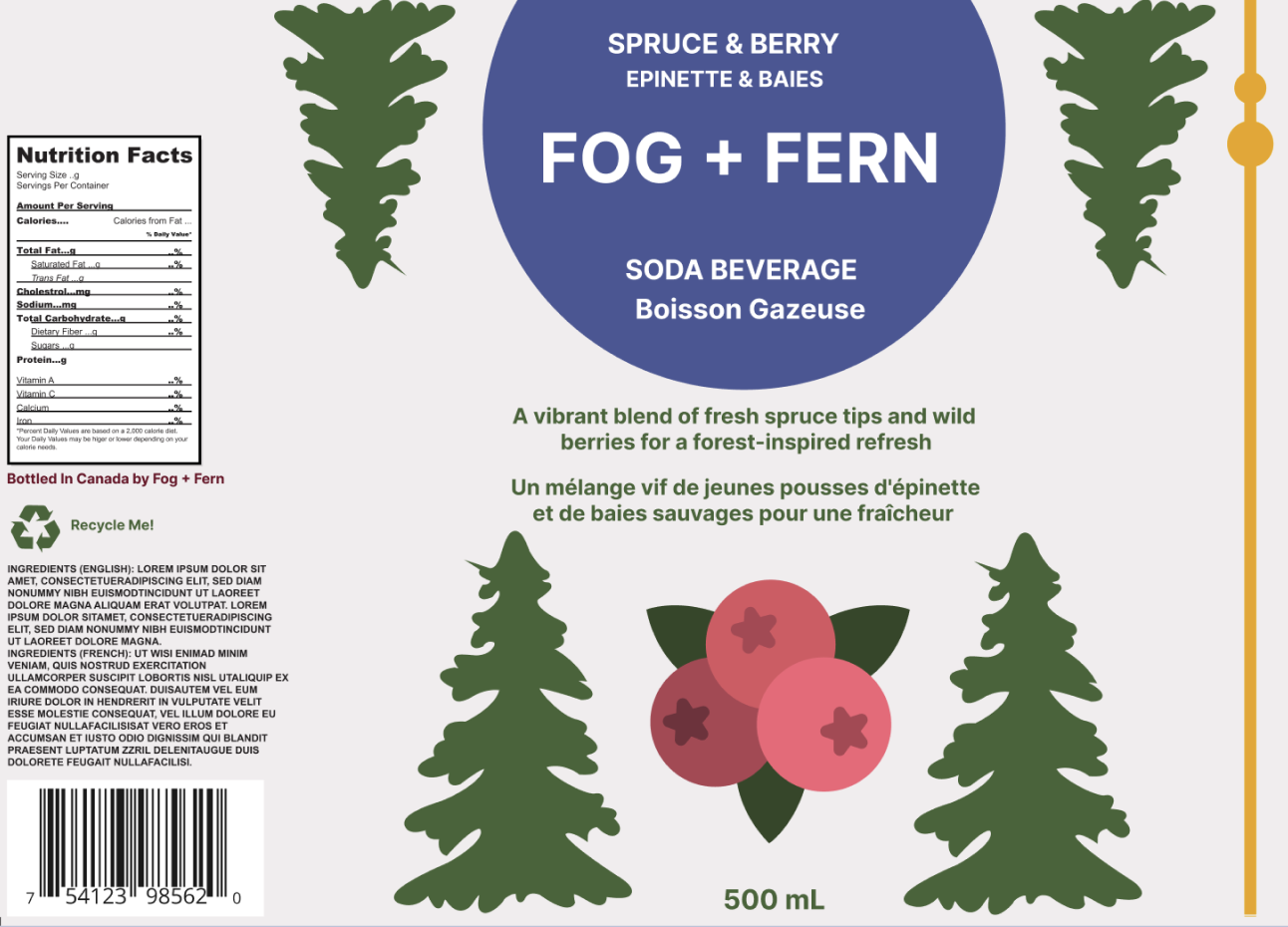
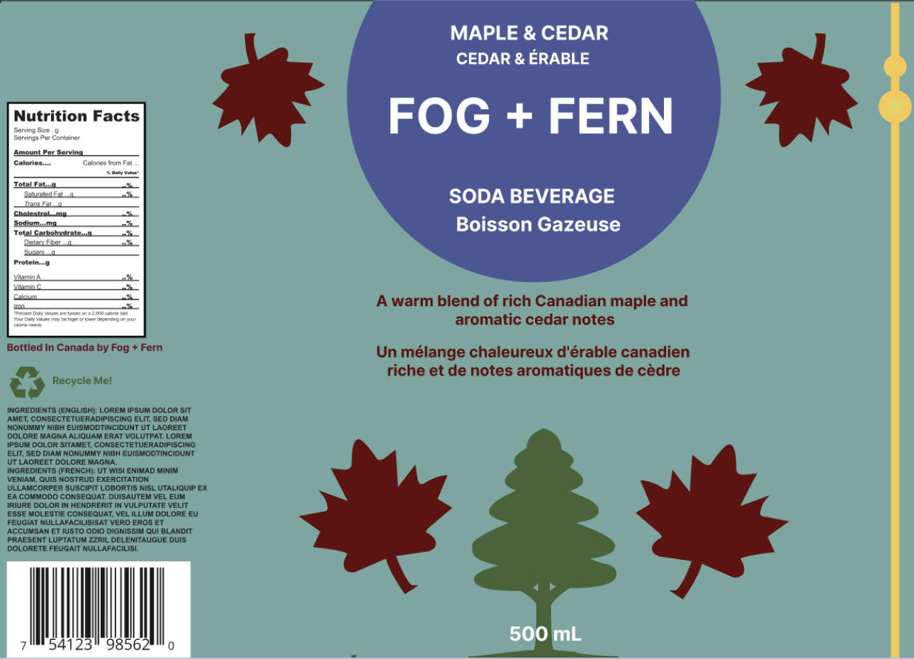
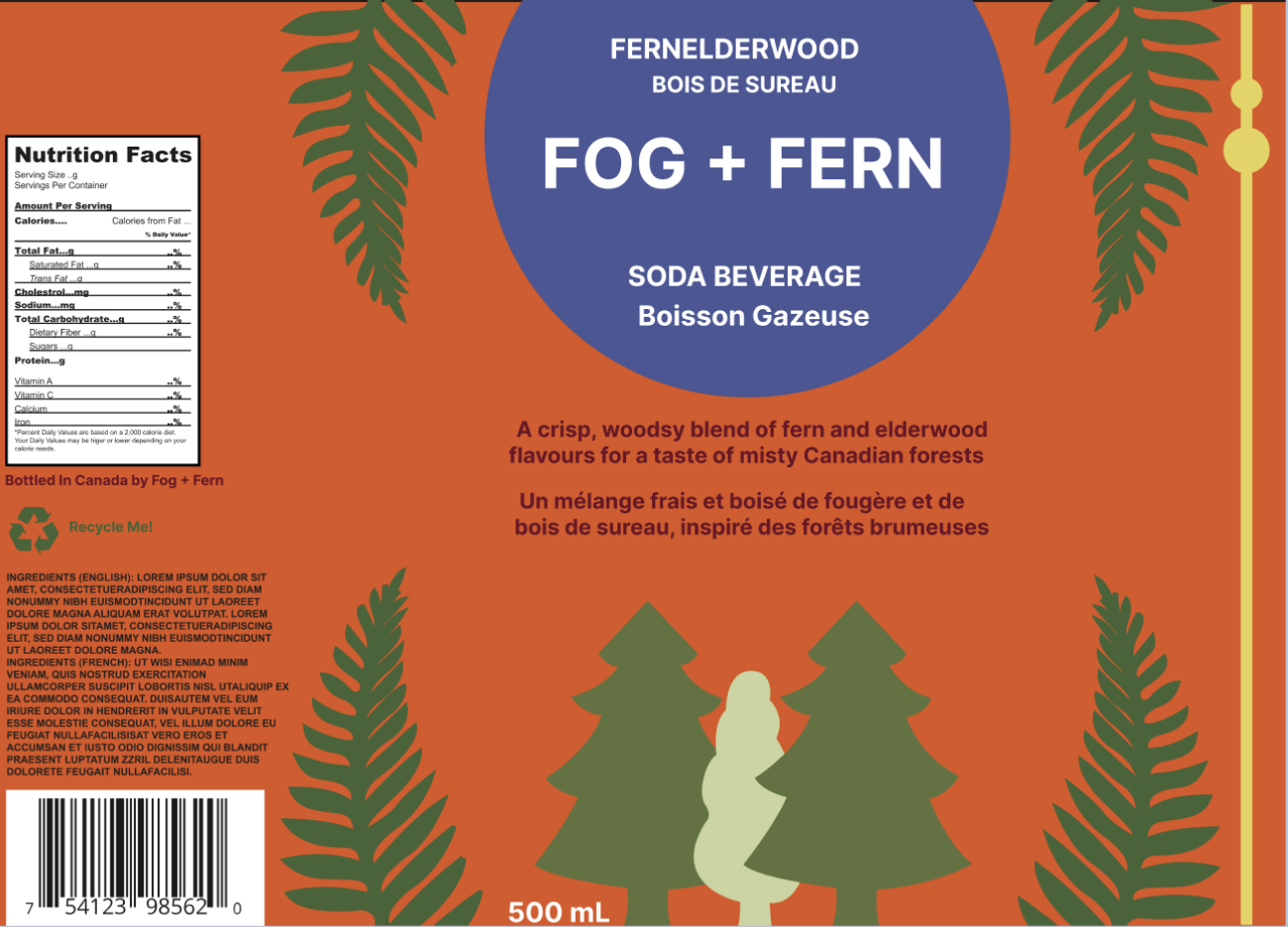
The sleeve designs emphasize balance and harmony, using subtle textures and natural colour palettes to enhance the feeling of freshness. This beverage company is geared towards younger people who are outdoor-oriented and health-wise. With this project I explored visual storytelling that connects design with nature-inspired flavours.
Maple + Cedar
The can design incorporates earthy reds and blue tones, reflecting the comforting, nostalgic essence of a cabin in the woods that the intended market enjoys.
Fernelderwood:
The design uses deep greens and oranges to capture the simplicity and beauty of nature, similar to what nature-enjoyers sympathize with.
Spruce + Berry:
The design features cool greens and deep reds, evoking a walk through a forest (that one might bring this beverage along for) filled with fresh, sun-ripened fruit.